How to Use the 2020 “It” Color in Your Home

Credit Stephen Kent Johnson
At the end of every year, Pantone announces the “It” color for the upcoming year. This color is supposed to not only be the next “in” color but also represent the mood and feel of what we expect out of the next year. For 2020, Pantone announced Classic Blue with the statement “Instilling calm, confidence, and connection, this enduring blue hue highlights our desire for a dependable and stable foundation on which to build as we cross the threshold into a new era.” While that sounds kind of dramatic, blue does give a very calm and stable feeling when used in a room.
While Pantone picks a specific shade, I don’t want to narrow the limits so lets focus on all of blue. In a recent survey from 1stdibs, 29% of designers prefer to use blue which is an increase of 15% from last year. Similarly, navy has doubled in favor since 2018. So what does this mean? It is time to add some blue into your life and your home and I am here to show you how.

Credit Josh Hemsley
How to Color Your Home
Use the 60 - 30 - 10 Rule. No this isn’t the code to a locker, it is a general rule for adding color to your space. This means that 60% is a dominant color, 30% is a secondary color and 10% is a fun pop. Translated, this generally equates to 60% being your walls, 30% being your upholstery and 10% being accents like plants, art, pillows, throws etc.
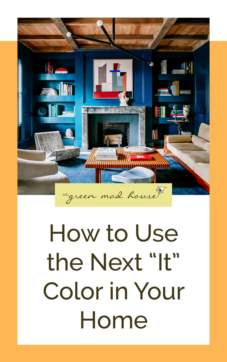
The Main Color
If you are like my mom and love painting the walls (seriously though, when we were growing up she went through a phase where it felt like rooms were changing colors every week) then this is probably your ideal option to get blue into your space. As can be seen in the photo above, the rich blue makes the entire room seem like it is hugging you. Paint is relatively cheap, I recommend Benjamin Moore, and with a solid weekend of work, you can have a transformed space. If you don’t want to tackle the entire room, then focus on an accent wall or, use the new hot trend of just painting half the wall to create a chair rail effect. If you are renting and can’t paint your walls, there are chic removable wallpapers. If you asked me 10 years ago if I would ever recommend wallpaper I would say you were crazy. Check out Spoonflower or The Lovely Wall for amazing options.

Credit Mike Marquez
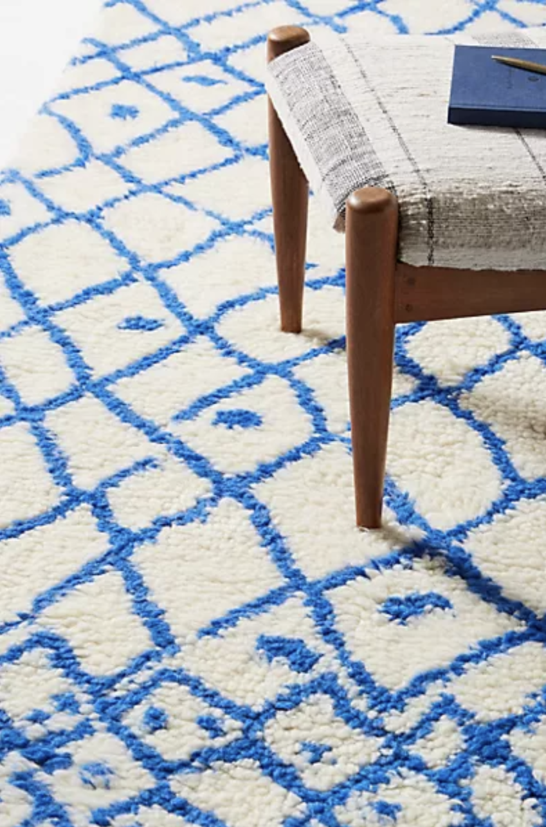
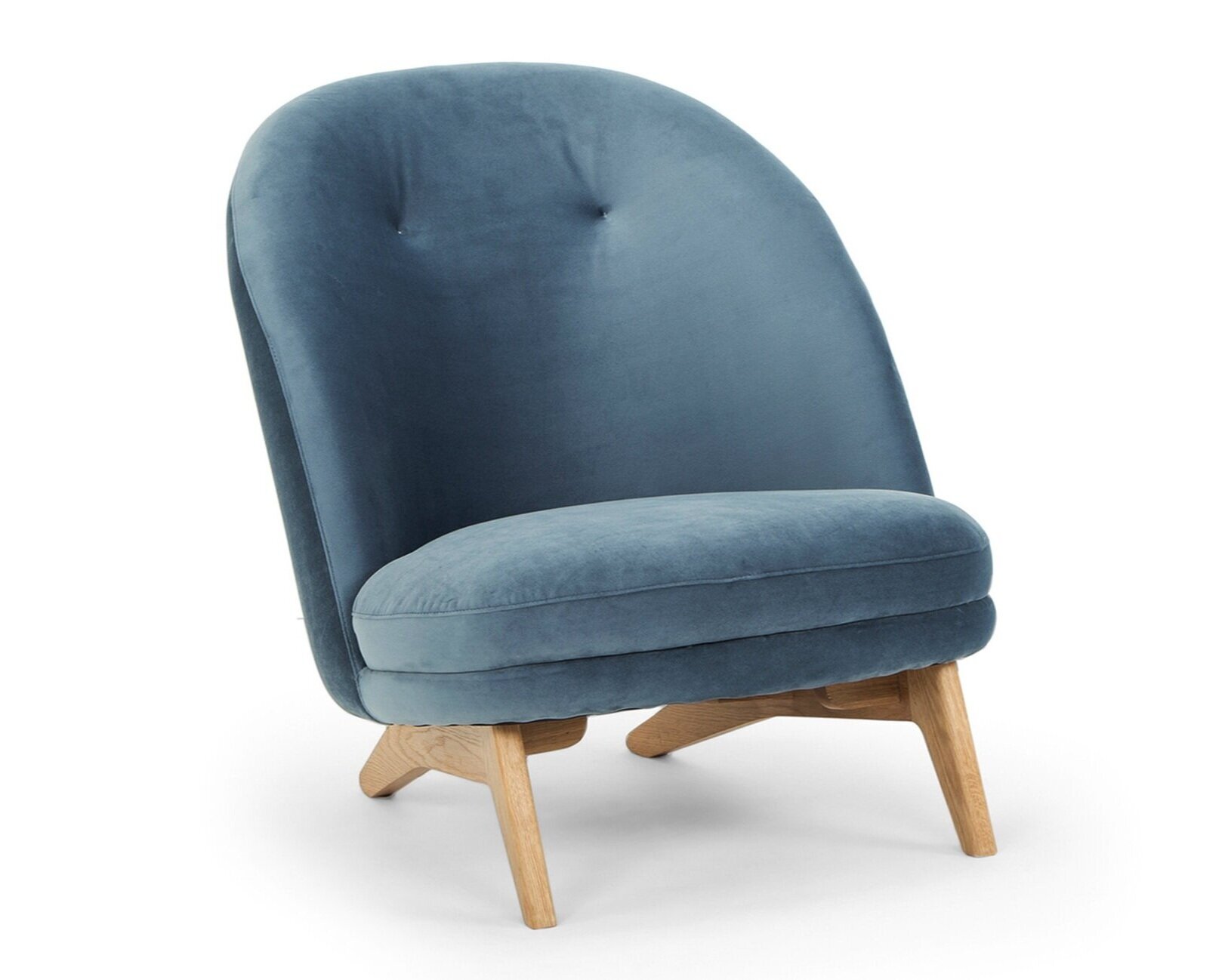
Secondary Colors
So if you are like me and hate painting walls and there is no way your landlord is going to get on board, then it is time to focus on the larger pieces in your room. Your bed, couch or arm chairs are a great place to pull in color while still keeping the space grounded. You can add in curtains and rugs to this conversation but similar to bedding, these could also be used in the 10% category depending on what you select. If you are going to select a bold couch, then maybe don’t also select a colorful rug, it is about balance. While upholstery generally makes up the bulk of this, no one says you can’t have a blue dresser or side table. Don’t limit yourself to just fabric!
Accent Colors
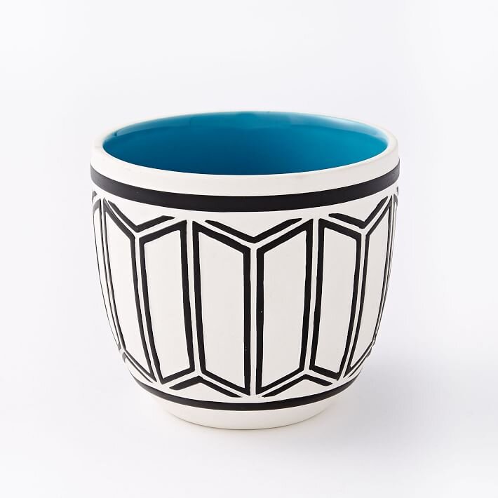
The 10% is probably my favorite part because it involves plants (!!!), shopping, and creativity. I strive for my home to be comfy so often I use throws and pillows to bring in color and texture. Honestly the more pillows the merrier. My house is also covered in plants, because of this I try to keep my pots more neutral (terracotta and white) but with some pops. I love when the inside, the rim, or the tray is colorful. If you want to be literal, there are even plants that have blue-tinged leaves. Blue Chalk Stick succulent and Agave are two that come to mind.
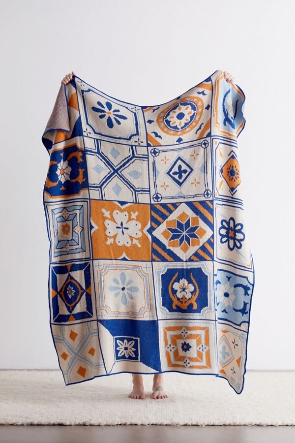
Buy Some Blue